Friday, February 9, 2018
Draft #2
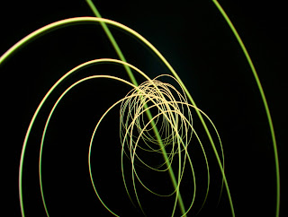
This week I took everyone's suggestions and added colors to my images. I also worked on adding some dimension to my photos. I moved backward while holding the light and it created an illusion of a tunnel and depth. I had a lot of fun playing with the color and creating new shapes. My goal next week is to continue to expieriment with color and shapes.


Subscribe to:
Post Comments (Atom)
"Best of Series"
Throughout these past three weeks, we have been working on our projects which I chose to follow Uta Berth's vision of creating blurred i...

-
This week we worked on Multi Frame Storytelling which is when you use two or more photos and I made my images into collages. Each of my pho...
-
This week I worked on using Uta Barth's style to create photo's that are out of focus but bright throughout the blur. I really enjoy...
-
This week we worked on doing portraits of our classmates however we had to use the style they have been using this entire year. This project...


I really like the incorporation of color! I think it added a lot to your series and makes the lighting stand out. I really like the images that include depth, because it adds a level of sophistication to your series. Great Work!!!!
ReplyDeleteI like how you took the suggestions to include color. I think that the shapes and patterns that you painted are really cool and unique. Keep up the great work!
ReplyDeleteThese are so cool! I think you should keep making photos that include depth to the lighting (like the second) and ones that have backgrounds other than pitch black (sixth). Good work!
ReplyDeleteI think the addition of color really diversified your photos! I also like how you have different colors in the same photo. My favorite photo is your 6th one because it seems almost as if you just drew on it. Great work!
ReplyDeleteThese are really good. I like the pop of color that you added, it gives a different type of variety to your images. I especially like your second to last one, it looks like it's a never ending spiral.
ReplyDeleteThese light paintings look so good with the colors you have chosen, especially when you have created a gradient of color or brightness. My only suggestion would be to make bigger paintings outside at night.
ReplyDeleteThese light paintings are great. I love the colors and all of the shapes, I Think you should try and create more complex ideas when it come to these Pictures.
ReplyDeleteI like your photos and how you incorporated color and made it more abstract. My suggestion is to not have that photo in the middle where there is light and you can see the bathroom.
ReplyDeleteGood job on the light painting. I like how your beginning to get some depth within your light painting. My only suggestion would be that keeping a black background calls more attention to the light, and when you have a brighter background you tend to lose the main focus. But overall great job.
ReplyDeleteI particularly like one of your photos where you mix a white with red. It made that photo stand out more and you should maybe consider adding more photos where you have a white and a brighter color to contrast it
ReplyDeleteI enjoy how your light paintings are thick and have a lot of volume. Overall very good draft.
ReplyDelete